Lurid Editions: Branding, Creative Cover Design & Typesetting
Design can be joyful when working with texts you feel passionate about. Since 2022, I have designed the branding for Lurid Editions, including book covers and typesetting. Lurid Editions is a Bristol-based imprint. It focuses on reprints of lost queer books from the 20th-century archive.
The word ‘Lurid’ means something vividly shocking or sensational. We wanted to represent this in the design and chose a bright fuchsia colour for the branding and cover design.
For the logo, we wanted something soft to counterbalance. D-M Withers, editor and director of Lurid Editions, suggested a fawn. Through a series of drawings, I developed the idea of keeping this little animal within a circle—a calm, self-contained space where it could rest in a gentle, almost meditative pose.
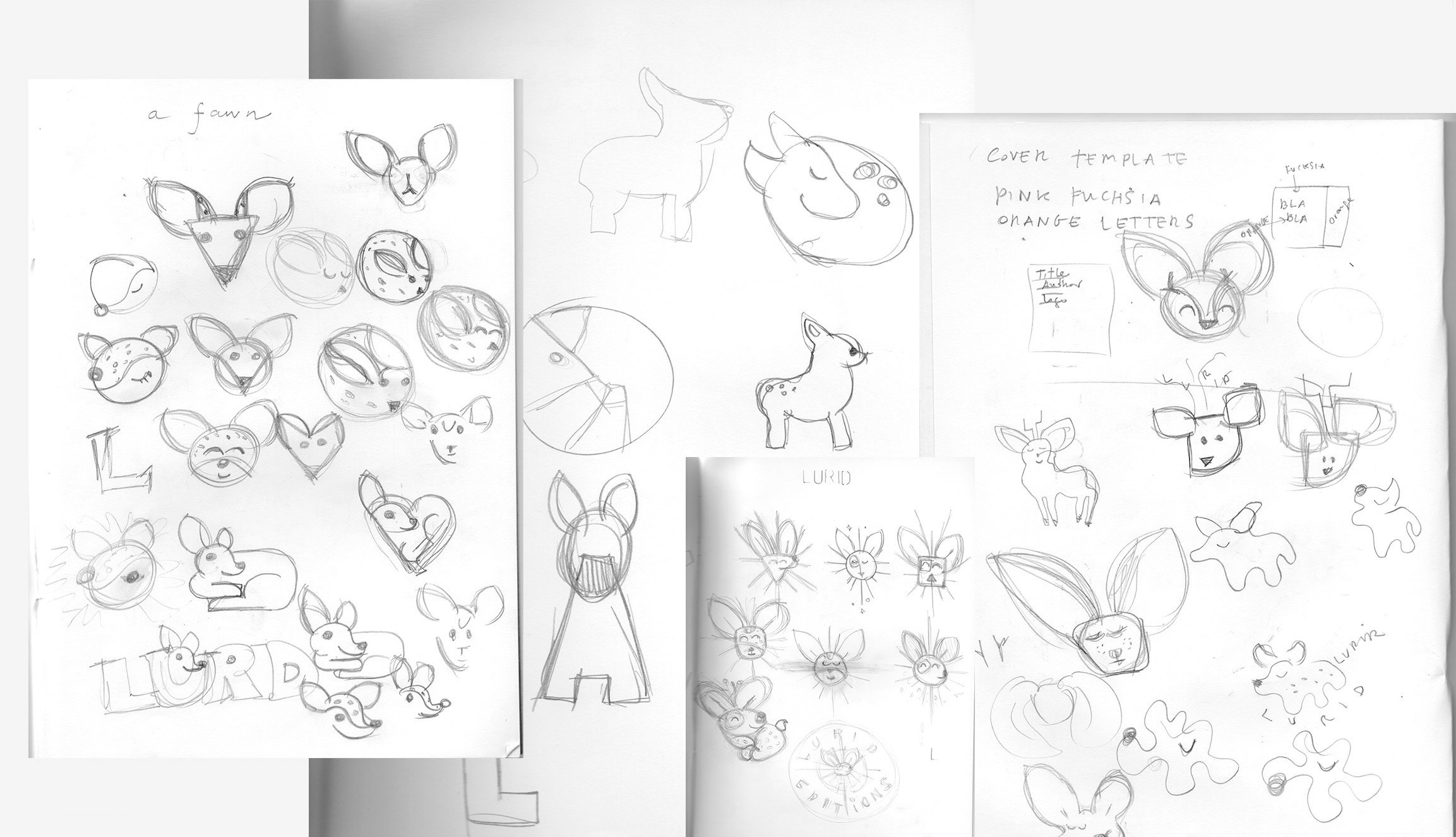
These were some of my sketches while creating the fawn logo. I think it shows my creative process and the sense of loss of time and space while drawing. I tend to draw curvy, bubble shapes.
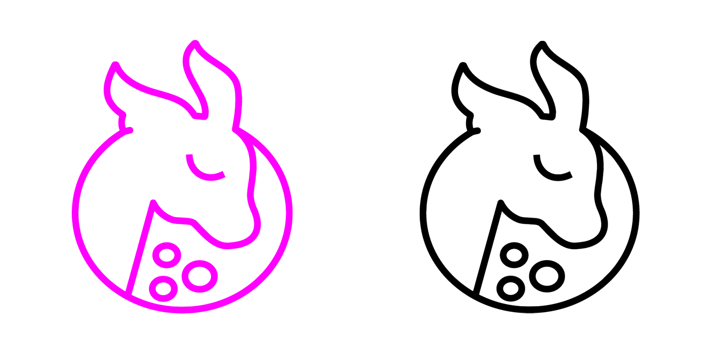
Here is the final logo that now lives across social media and in print.
For our first titles—Chase of the Wild Goose, The Awakening of Indian Women, and The Milkman’s on His Way—we focused on finding a vivid fuchsia that would become central to our visual identity. Bright, over-bright, brilliant, glaring, fluorescent, harst or unnatural effect were concepts we had in mind.
Over time, we couldn’t resist introducing additional elements: proud trans motifs, splashes of glitter, and expansive night skies filled with constellations.
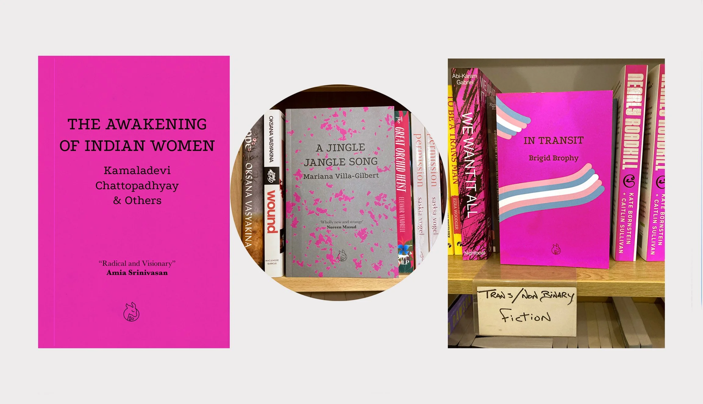
Some of the titles spotted at Gay’s The Word bookshop in London.
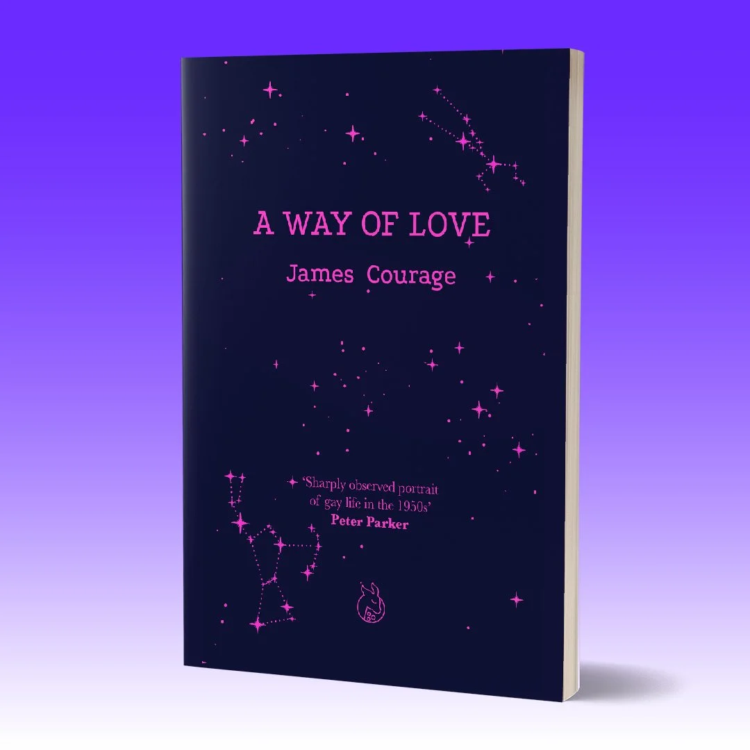
This is the excerpt I was given, which inspired the front and back cover design.
“I had taken myself alone to listen to music at the Festival Hall, one evening in early December. The night was cold. After the frost of the outer air I was glad to find myself in the floating resonant heat of the hall, one member of an audience fortuitously unified by a happiness in prospect and for the most part as accidental in their proximity, one to another, as so many grains of salt on a plate [...]
The frost had given the air a chill so arctic that the stars seemed to ache in the sky over the river and the city.”
A Way of Love by James Courage
My creative process varies with each project. Pen and paper are essential tools for bringing thoughts and emotions into view. I am particularly fond of using a scanner, which allows me to experiment before moving to the computer. Developing my skills in Illustrator and learning new techniques has been equally enjoyable. Conversations with people, along with attending workshops and lectures—especially those focused on type design, drawing, zine making—are crucial to my ongoing education.
Playing with the scanner
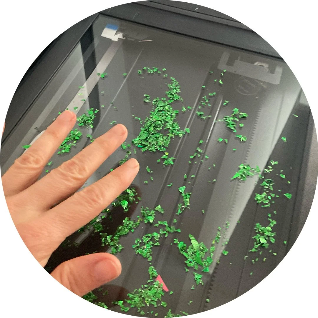
I tried to create a vector pattern in Illustrator for Jingle Jangle Song, but nothing quite worked. Then I rescued a bottle of green glitter in the cupboard—so I thought, why not splash it directly onto the scanner glass?
I often find inspiration while journaling on public transport or simply observing my surroundings. Although I have a dedicated table at home, I rarely spend long periods there; ideas tend to take shape when I’m out in the world, walking, cycling freely, meeting people.
Typesetting books
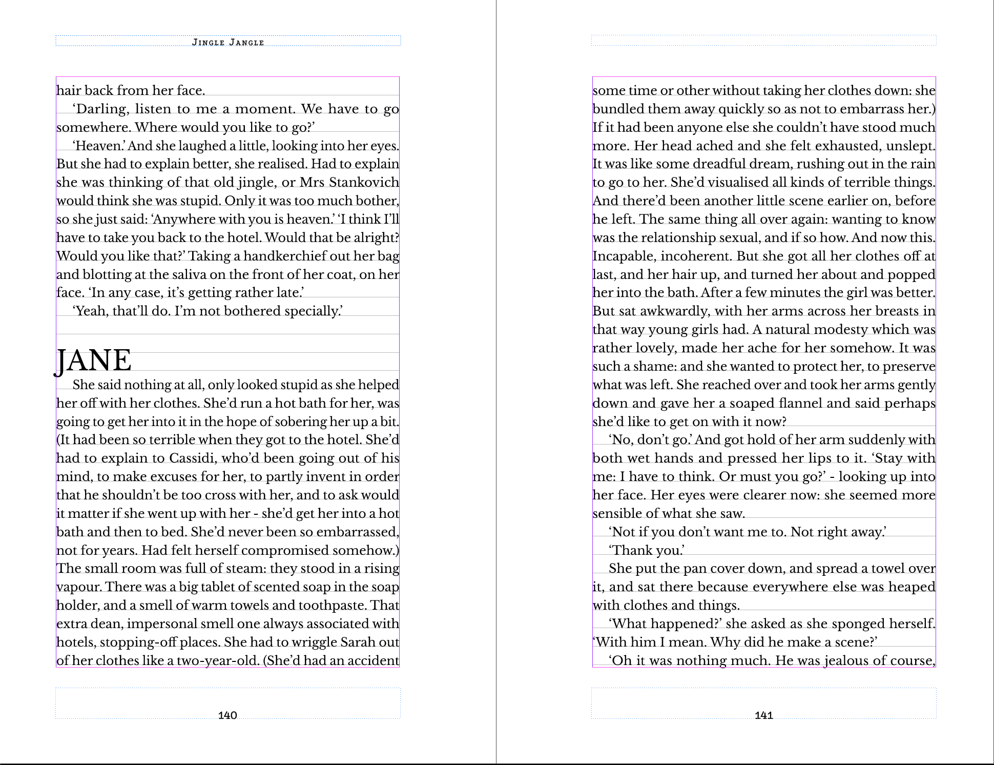
For fiction novels it is common to have 32 lines for a text layout spread and an average of 8 to 11 words per line.
We decided to typeset the books in Baskerville font, as it’s well-known by readers over the last centuries. Perhaps the fabulous vertical axes are what make this typeface so special.
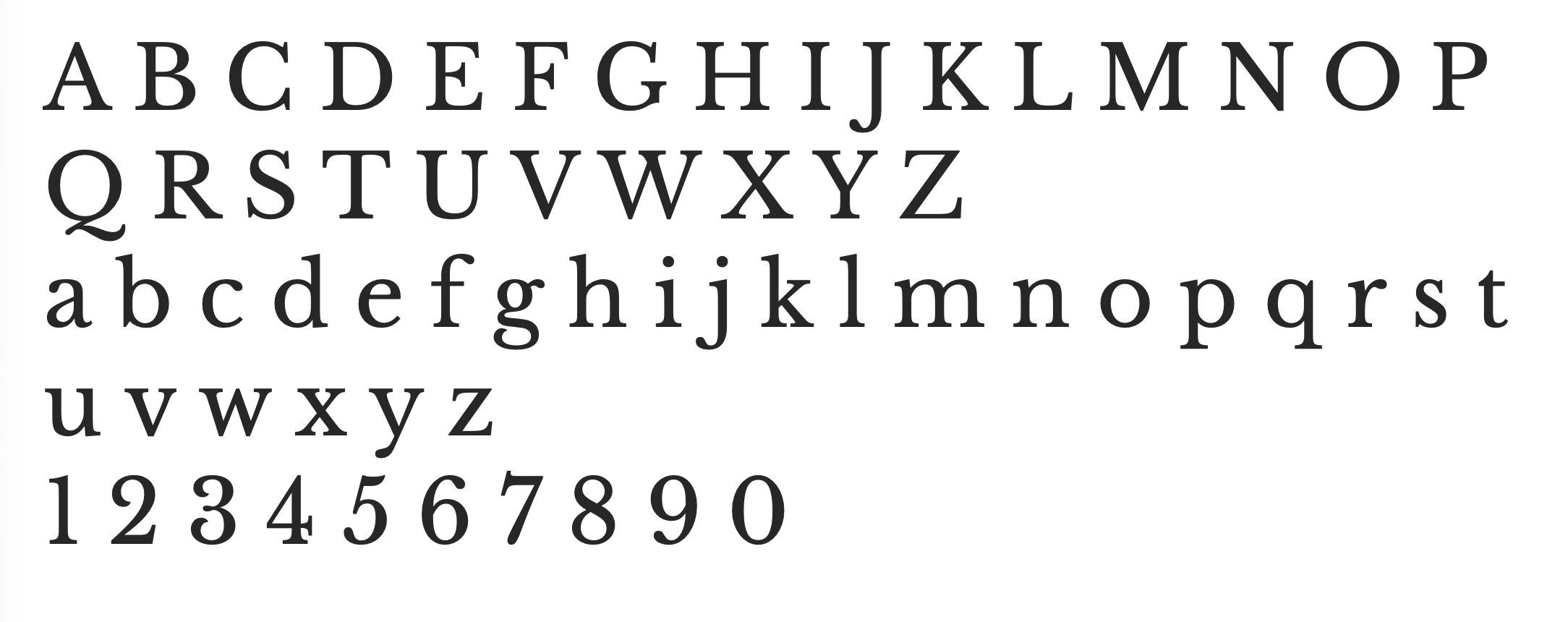
Regular Libre Baskerville.
I love the older book cover designs of Lurid’s authors too. They evoke a strong sense of time and connect me to queer, normative and other aesthetics of the 20th century. Through Lurid Editions, we bring together authors linked by their queerness yet separated by decades, styles, identities, and levels of popularity. I like to celebrate each author, creating something unique for every title. When an author has been misrepresented or moved into silence or ostracism, I feel compelled to design their new cover with an even more openly queer expression.